How can we take the pain out of enrolling in your benefits?
Redesign of KTBSOnline
Benefits Enrollment Path
KTBSOnline is a fully customized web portal that facilitates the enrollment and management of employee benefits. It provides a benefits management system for HR professionals and web portal for employees.
The redesign of the benefits enrollment path—the most visible part of our site to both HR reps and employees—was just the first phase of the site wide redesign. This meant that the visual language we established here would eventually be implemented throughout the side.
Currently there was no way to enroll in benefits using a smart phone, so in addition to the redesign we created a mobile app.
MY ROLE
Design Research
Ideation
Visual Design
User Testing
Prototypes
The Challenge.
The Enrollment Process was confusing. Users were giving up and calling the Call Center for help. In addition, the look was dated, making it difficult for Sales to make the case that our technology is in line with our competitors.
The Approach.
I worked together with my team comprised of a UX designer and a developer to gather project requirements, obtain feedback and conduct user testing on functional prototypes, and visual designs, both for web and mobile.
UI Design
-
Iconography
With the goal to modernize the look and feel of our enrollment process, as well as improve ease of use we developed a new set of icons that could be used throughout. These helped the process feel more approachable and user-friendly.

-
Typography
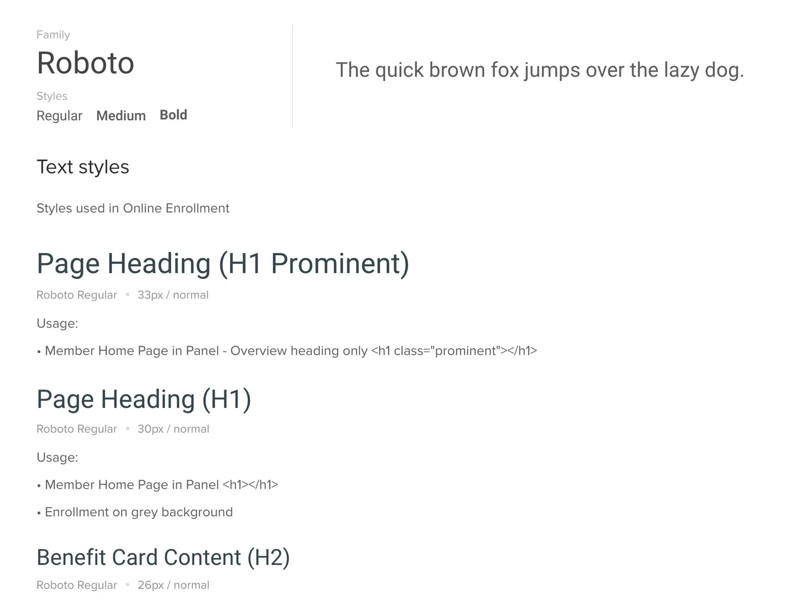
The Google font Roboto was chosen for it’s readability and it’s friendly and approachable nature. Specifying when and where each treatment should be used helped make design and development easier and straight forward.

-
Patterns
Careful consideration was given to exploring button and navigation patterns to ensure the process was intuitive and users weren’t left questioning where to click.
The color green, often associated with “Go” or “Yes” was chosen for the main call to action on the page, while blue or white buttons were chosen for secondary actions, depending on importance.

User Testing
In person User Testing was performed twice throughout the development of the project on both desktop and mobile. Our team identified some areas where we had questions and possible pain points and used those to create specific tasks for the users to complete. This proved to be very valuable because not only were we able to get answers to our questions, we were able to identify issues that we had not been able to foresee.


